
Contents
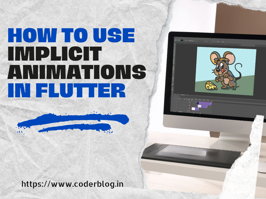
How to use implicit animations in Flutter
1. Introduction
Many widgets can help manage the animation in Flutter, and these widgets can be called implicit animation widgets. So the implicit animation widget starts with Animated in Flutter. These are pre-programmed animations where you don’t need to write the animation code yourself. Instead, you only need to change some properties or values.
I will introduce it in detail in the following article
2. Implicitly Animated Widget
All of the implicit animate widgets are inherited from ImplicitlyAnimatedWidget, please find the below codes for ImplicitlyAnimatedWidget
const ImplicitlyAnimatedWidget({
        super.key,
        this.curve = Curves.linear,
        required this.duration,
        this.onEnd,
});
1) curve
In Flutter, the Curves class provides many common animation curves (Curves), which define the speed mode of animation and control the movement of animation. The following are all enumeration values in the Curves class:
| No. | Animation Type | Description |
|---|---|---|
| 1 | linear | linear animation |
| 2 | easeIn | Animation that slowly starts to accelerate |
| 3 | easeOut | Quickly start decelerating animation |
| 4 | easeInOut | Animation that slowly starts to accelerate and then decelerates |
| 5 | decelerate | slow down animation |
| 6 | bounceIn | Animation bounce effect enters |
| 7 | bounceOut | Animation bounce effect exits |
| 8 | bounceInOut | Animated bounce effect entry and exit |
| 9 | elasticIn | Animation elastic effect enters |
| 10 | elasticOut | Animated elastic effect exits |
| 11 | elasticInOut | Animated elastic effects entering and exiting |
| 12 | astOutSlowIn | Animation enters quickly and exits slowly |
| 13 | slowMiddle | Animation slow middle |
| 14 | ease | Slow start and end, faster in the middle |
| 15 | easeInCirc | Circular curve starts slowly |
| 16 | easeOutCirc | The circular curve ends slowly |
| 17 | easeInOutCirc | Circular curve starts and ends slowly |
| 18 | easeInCubic | The cubic curve starts slowly |
| 19 | easeOutCubic | The cubic curve ends slowly |
| 20 | easeInOutCubic | Cubic curve starts and ends slowly |
| 21 | easeInExpo | The exponential curve starts slowly |
| 22 | easeOutExpo | The exponential curve slowly ends |
| 23 | easeInOutExpo | The exponential curve starts and ends slowly |
| 24 | easeInQuad | The quadratic curve starts slowly |
| 25 | easeOutQuad | The quadratic curve ends slowly |
| 26 | easeInOutQuad | Quadratic curve starts and ends slowly |
| 27 | easeInQuart | The quartic curve starts slowly |
| 28 | easeOutQuart | The quartic curve ends slowly |
| 29 | easeInOutQuart | Quadric curve starts and ends slowly |
| 30 | easeInQuint | Quintic curve starts slowly |
| 31 | easeOutQuint | The quintic curve ends slowly |
| 32 | easeInOutQuint | Quintic curve starts and ends slowly |
| 33 | easeInSine | Sine curve starts slowly |
| 34 | easeOutSine | The sine curve ends slowly |
| 35 | easeInOutSine | Sine curve starts and ends slowly |
Each curve has its own unique acceleration and deceleration patterns. Developers can choose the appropriate animation curve according to specific needs to achieve smooth animation effects. You can find more information about these curves in the official Flutter documentation: Flutter Curves Class
2) duration
The animation duration
3) onEnd
It will be called after the animation has been completed, you can trigger another animation with this parameter.
2. How to use
To use implicit animation, just use the widgets starting with Animated and change their properties value within state management then you will see the animations.
Please find the example below
2.1 Use the AnimatedContainer :
1) Define the variables of the animate properties
double _width = 200;
double _height = 200;
Color _color = Colors.red;
BorderRadiusGeometry _borderRadius = BorderRadius.circular(16);
2) Create the widget with AnimatedContainer
@override
Widget build(BuildContext context) {
  return Scaffold(
    appBar: AppBar(
      title: const Text('Animation controller'),
    ),
    body: Center(
      child: AnimatedContainer(
        width: _width,
        height: _height,
        decoration: BoxDecoration(
          color: _color,
          borderRadius: _borderRadius,
        ),
        // the duration of animation
        duration: const Duration(seconds: 1),
        // set the curve to let the animation more smooth
        curve: Curves.fastOutSlowIn,
      ),
    ),
    floatingActionButton: FloatingActionButton(
      onPressed: _randomize,
      child: const Icon(Icons.play_arrow),
    ),
  );
}
3) Create the _randomize method to random to change the property values
final random = Random();

void _randomize() {
  setState(() {
    // generate random value with width & height
 _width = random.nextInt(300).toDouble();
 _height = random.nextInt(300).toDouble();
    // generate random color
 _color = Color.fromRGBO(
 random.nextInt(256),
 random.nextInt(256),
 random.nextInt(256),
      1,
 );
    // generate random border radius
 _borderRadius = BorderRadius.circular(random.nextInt(100).toDouble());
 });
}
and you will see the result below:

2.1 Use the AnimatedOpacity:
1) Define the property variable
double _opacity = 1.0;
2) Create the widget with AnimatedOpacity
@override
Widget build(BuildContext context) {
  return Scaffold(
    appBar: AppBar(
      title: const Text('Fade In & Fade Out'),
    ),
    body: Center(
      child: Column(
        mainAxisAlignment: MainAxisAlignment.center,
        children: [
          AnimatedOpacity(
            opacity: _opacity,
            duration: const Duration(seconds: 1),
            curve: Curves.fastOutSlowIn,
            child: const FlutterLogo(size: 200),
          ),
          ElevatedButton(
            onPressed: _changeOpacity,
            child: const Text('Fade In/Out'),
          ),
        ],
      ),
    ),
  );
}
3) Create the change method to update the opacity property
void _changeOpacity() {
    setState(() => _opacity = _opacity == 0 ? 1.0 : 0.0);
 }
and you will see the result below:

3. Animated widgets
You can find the below widgets starting with Animated, and these are implicit animation widgets, you can use them the same with AnimatedContainer and AnimatedOpacity
| No | Widget | Description |
|---|---|---|
| 1 | AnimatedOpacity | Fades a widget in and out by changing its opacity. |
| 2 | AnimatedContainer | Animates properties of a container, such as size, color, and border. |
| 3 | AnimatedPositioned | Animates the position of a child within a Stack widget. |
| 4 | AnimatedAlign | Animates the alignment of a child widget. |
| 5 | AnimatedBuilder | A flexible widget that can be used to create custom animations. |
| 6 | AnimatedPhysicalModel | Animates properties of a physical model, such as elevation and shape. |
| 7 | AnimatedCrossFade | Fades between two children, allowing for smooth transitions. |
| 8 | AnimatedDefaultTextStyle | Animates changes to the text style, such as font size and color. |
| 9 | AnimatedIcon | Provides animated icons, such as transitions between states. |
| 10 | AnimatedList | A list that supports animation for adding or removing items. |
| 11 | AnimatedSwitcher | Smoothly transitions between multiple widgets based on a key. |
| 12 | AnimatedPadding | Animates changes in padding around a child widget. |
| 13 | AnimatedSize | Animates size changes, automatically adjusting to the new size. |
4. Custom implicit animation
If the above AnimatedWidget can’t fulfill your requirement, you can try to use TweenAnimationBuilder to create custom implicit animation.
4.1 The TwenAnimationBuilder constructor
First, we can take a look at the TwenAnimationBuilder constructor
TweenAnimationBuilder({
  Key? key,
  required Tween<T> tween,
  required Duration duration,
  required Widget Function(BuildContext, T, Widget?) builder,
  void Function()? onEnd,
  T Function()? onStatusChanged,
  Curve curve = Curves.linear,
  Widget? child,
})
The parameters as below
1) tween: A Tween object that defines the start and end values of the animation.
2) duration: The duration of the animation.
3) builder: A callback function used to build the animation effect. This function is called during each frame of the animation.
4) onEnd: A callback function when the animation ends.
5) curve: Defines the curve of the animation progress.
6) child: A static child component that does not change with the animation to optimize performance.
4.2 How to use
We will create an animation effect that gradually changes color with a Flutter logo.
We define a variable to switch the initial value and end value of the gradient color. Tween is the abbreviation of Between. After we set the starting value of Between, Tween will automatically complete the color value switching. For color gradient, we use ColorTween to set the starting color value.
After clicking the button, change the starting value of the color to achieve the Tween animation effect.
1) Define a variable to change the color
bool changeRedToBlue = false;
2) Based on the variable to change the begin and end value in tween
tween: ColorTween(begin: changeRedToBlue?Colors.yellow:Colors.red, end: changeRedToBlue?Colors.red:Colors.yellow),
3) Change the variable in setState
onPressed: (){
  setState(() {
 changeRedToBlue =!changeRedToBlue;
 });
}
the complete codes as below
class TweenAnimationDemo extends StatefulWidget {
  const TweenAnimationDemo({super.key});

  @override
  State<TweenAnimationDemo> createState() =>
      _TweenAnimationDemoState();
}

class _TweenAnimationDemoState extends State<TweenAnimationDemo> {
  bool changeRedToBlue = false;

  @override
  Widget build(BuildContext context) {
    return Scaffold(
      appBar: AppBar(
        title: const Text('Tween Animation Demo'),
      ),
      body: Center(
        child: Column(
          mainAxisAlignment: MainAxisAlignment.center,
          children: [
            TweenAnimationBuilder<Color?>(
              tween: ColorTween(begin: changeRedToBlue?Colors.yellow:Colors.red, end: changeRedToBlue?Colors.red:Colors.yellow),
              duration: const Duration(seconds: 1),
              builder: (BuildContext context, Color? color, Widget? child) {
                return ColorFiltered(
                  colorFilter: ColorFilter.mode(color!, BlendMode.modulate),
                  child: child,
                );
              },
              child:const FlutterLogo(size: 200),
            ),
            const SizedBox(height: 50,),
            FilledButton(onPressed: (){
              setState(() {
                changeRedToBlue =!changeRedToBlue;
              });
            }, child: const Text('Toggle Color')),
          ],
        ),
      ),
    );
  }
}
and you will see the result below:

5. Conclusion
The implicit animation is easy to create, you can use the built-in widget to make the animations, and you can use different effects with curve, but you just can change the widget properties and a few controls, so it always forwards and no repeat. You can create a custom animation based on TweenAnimationBuilder, which can define the animation’s effect between start and end values. So if you want to create simple animations and less to control, implicit animation will be your choice.


